Analysis of COVID19 Deaths by Population Density and Social Vulnerability
The New York Times released their data on coronavirus cases a couple days ago to facilitate research and understanding how to best respond to the disease. Aaron and I spent the weekend crunching some of the numbers — we’ve just scratched the surface, but I thought I would share some of what we have found already. These data, even something as cut and dry as deaths, are subject to the limitations on how available testing is in a given area, which likely varies quite a bit at this stage. So, with that in mind we still thought we would see what we could learn. New York City is excluded from these analysis because it is already such an outlier it dwarfs the rest of the graphs. The data includes cases as of 3/27/20, using the 3/28/20 NY Times data file.
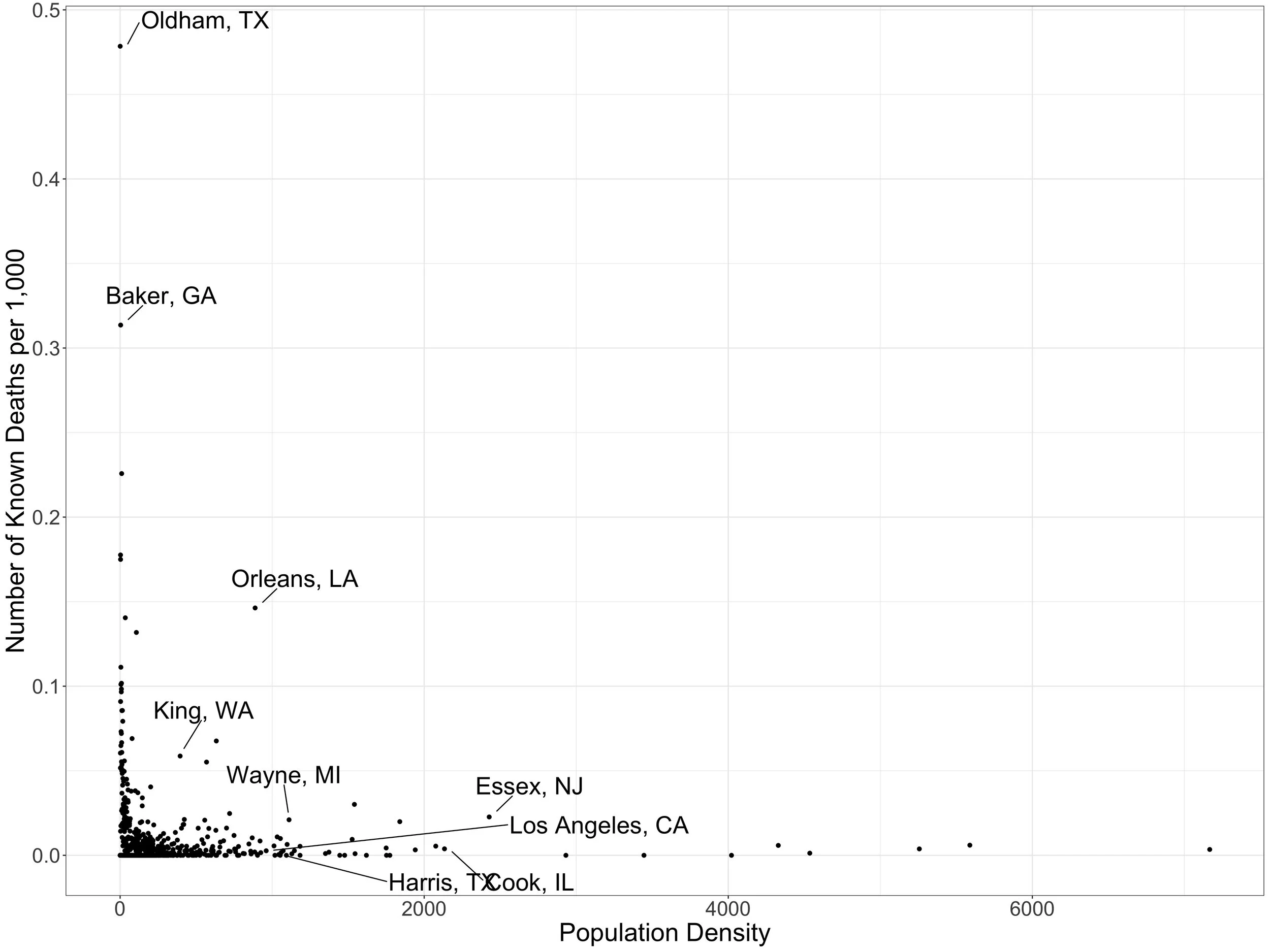
We started with plotting coronvavirus deaths against county-level population density (persons per square kilometer) .

Plot of coronavirus deaths by population density at the county level.
What is noticeable here is that population density does NOT seem to matter that much. Plenty of medium and less dense counties have a fair number of deaths, while plenty of densely populated areas do not. We highlighted a few counties as examples. We then adjusted the deaths by county population to look at death rates rather than raw numbers of deaths.
Coronavirus deaths per 1,000 population by population density at the county level.
Same conclusion here — coronavirus death rates per population can be high or low in communities ranging across the spectrum from high density urban areas to very rural areas.
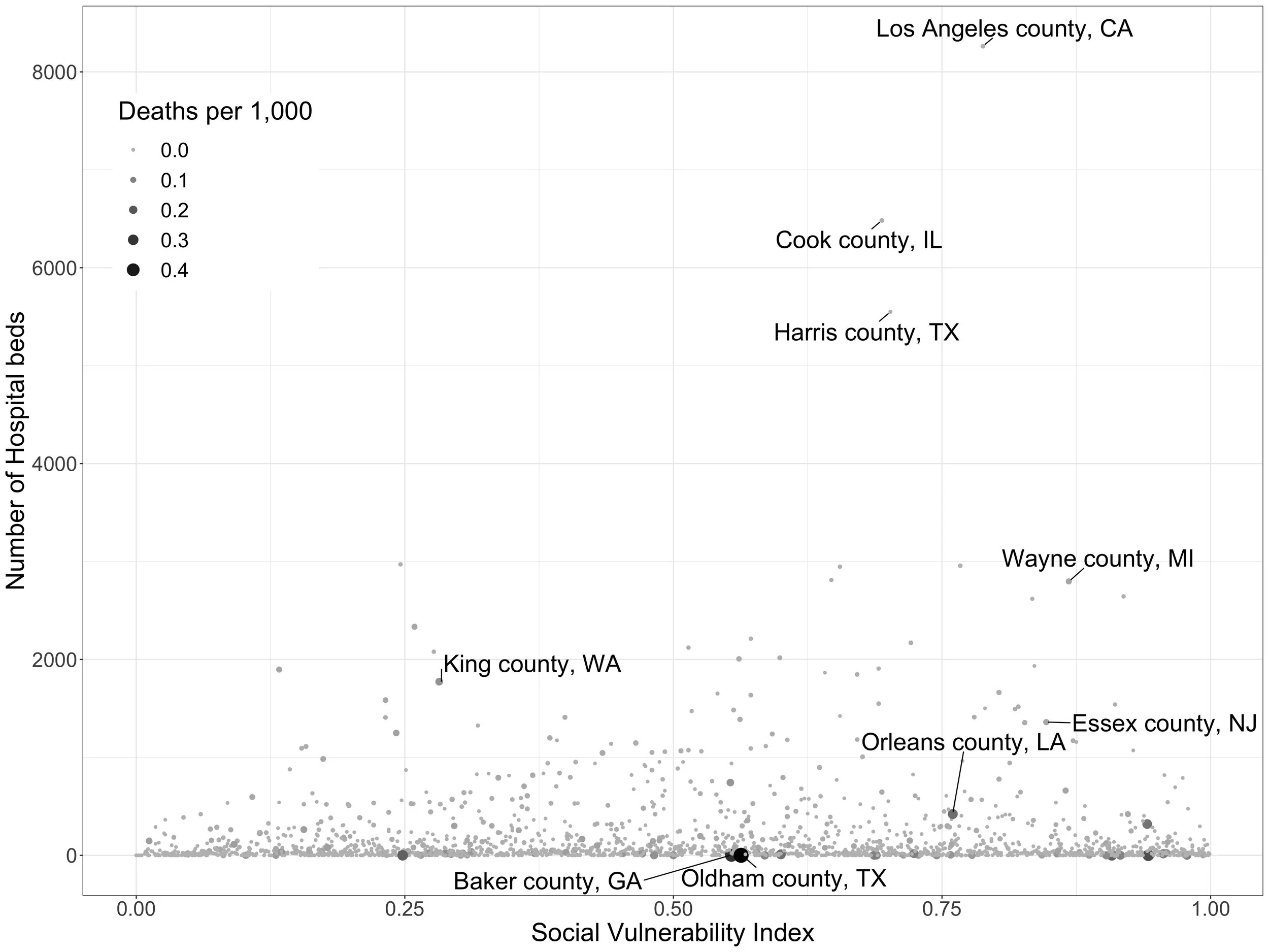
Next, we looked at social risk factors using the CDC’s Social Vulnerability Index (SVI), which measures social factors like poverty, lack of access to transportation, and crowded housing in U.S. communities. Again using county-level data, we graphed general medical-surgical hospital bed availability against the SVI for each county, then made the size of the dot for each county proportionate to the number of deaths there.

Plot of the number of medical and surgical hospital beds by the Social Vulnerability Index by county. Dots for each county are sized proportionately to the number of coronavirus deaths in that county.
As with population density, coronavirus deaths span the spectrum of more and less vulnerable communities. We’ve highlighted some of the more vulnerable counties with fewer hospital beds here. The graph looks similar when death rate, rather then number of deaths, is included.
Plot of the number of medical and surgical hospital beds by the Social Vulnerability Index by county. Dots for each county are sized proportionately to the number of coronavirus deaths per 1,000 population in that county.
I am finding these graphs unnerving because to me it looks like the epidemic has been seeded but is just getting going in many, many communities.
Finally, we looked at the SVI again, this time in relation to the percentage of older adults (>60 years) in a community.
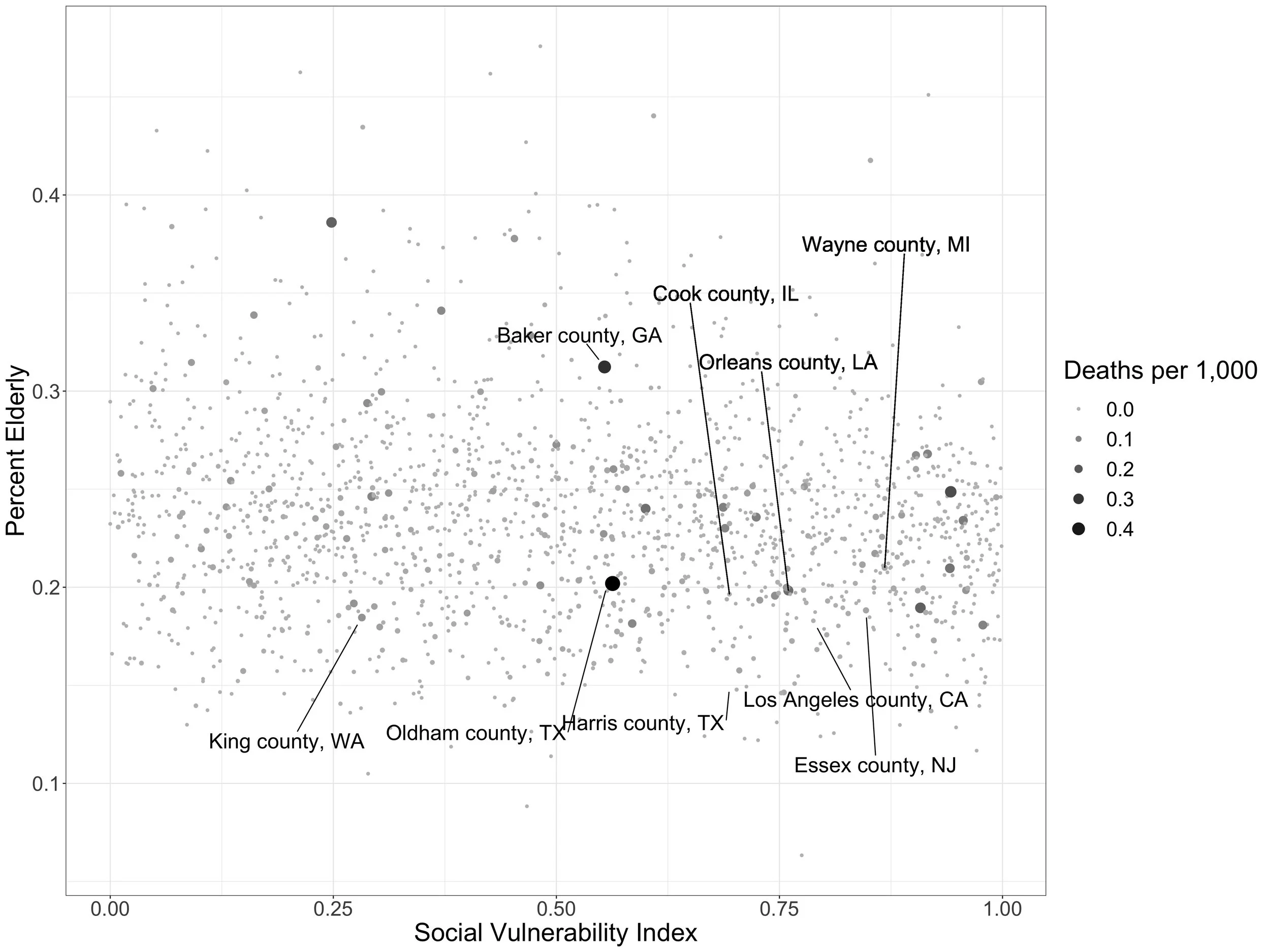
Plot of the percentage of the population over age 60 by the Social Vulnerability Index by county. Dots for each county are sized proportionately to the number of coronavirus deaths per 1,000 population in that county.
Counties more towards the top right of the graph are likely to be more vulnerable to severe impacts as the virus moves through the community due to a combination of being more socially vulnerable and having an older population.
So, to summarize: coronavirus deaths have already impacted both rural and urban areas, as well as areas with both fewer and less social risks. Some areas with older, more socially vulnerable populations are likely to experience disproportionate impacts as the impact of the virus progresses in those regions.
As more of a personal impression, it looks like the virus is still very early in its course in many communities. Hopefully efforts at non-pharmaceutical interventions will blunt the impact in some of these areas.
More analysis to come as time permits…